Suprematist Architecture Presentation
The presentation overall was excellent. Both speakers spoke very clearly and relied on no script or reading from the power point. They also continuously interacted with their presentation when required which boosted their presentation as well.
The presentation clearly explained a comparison between the remuneration attributes of a freelance architect versus a normal 'cubicle/office' architect. They listed helpful pro's and con's between the two which included:
Freelance:
-more freedom
-no small fish in a big fish environment
-get to work your own hours
- have to chase up invoices instead of being paid automatically like a office architect job
There was also discussion on the value of remuneration and what affects it which included your level of experience, business size, industry standards, the complexity of the job, the job position as well as the location of the particular job.
An example breakdown of how remuneration could work was also included which was helpful in shedding light on some of the expectations to have when deciding how much you should charge. An important takeaway that I noted was to charge the client as you go instead of receiving one lump sum payment at the end. So instead of waiting 2 months for the project to be finished and getting one large sum at the end, it would be more feasible to charge 25% for a particular task when it was completed, and another 15% when another task was completed and so on up until the conclusion of the project.
Thursday, 22 May 2014
Saturday, 17 May 2014
Conflict Group Presentations (Feedback)
Conflict Aerial Ropeway Presentation (Rochelle, Eugelyne, Jesharelah, Reina, Shaun)
The presentation overall was fairly good and quite simple however there was some heavy reading off of the presentation slides and far too much text with too little images on every slide. Presentation content was good as well with an explanation of the concept of conflict and examples with solutions to conflicts being used throughout the powerpoint.
The video was very entertaining and engaging and involved the members re-enacting a number of different scenarios (one for every point/topic that was raised in their presentation) regarding conflicts in group/collaborative situations and potential solutions/resolutions.
Conflict Suprematist Architecture Presentation (Hanbing, Ben, Daming)
There was very heavy reading off of their script however their presentation did not have blocks of texts and they weren't re-reading their presentation slides. The presentation layout and design was very good and had clear concise images including graphs and hierarchy diagrams. The presentation also included examples of personal group conflict problems as well as the solutions that they came up with.
The video was excellent with great effects and crisp audio clarity. It felt professionally edited and displayed various conflict examples similar to the ones in the other conflict presentation. Like the other video presentation, this one also touched on all the topics discussed during the powerpoint.
Both presentations illustrated the problems that conflict has on group projects and various ways to go about resolving such conflicts. An important point brought up was the fact that conflicts can cause a project to fail as a result of arguments and lack of member coordination or even a lack of allocated work being completed. Resolutions including sit-down meetings for mediation and steps such as acknowledging the problem and discussing its impact or even prevention from the beginning is being considered for future group projects.
Intellectual Property Group Presentation (Feedback)
Some feedback on the Intellectual Property presentations:
Intellectual Property Suprematist Architecture group presentation (Alyssa & Vedran)
The presentation was very good overall. They utilised a software called Pow Toon to generate an easy to understand yet very eye catching animation. The presentation was laid out in logical manner and explained the details of intellectual property in easy to understand language with relation to their project.
The powerpoint presentation itself wasn't as clean or engaging however. There was a copious amount of text used throughout the power point with little colour and a scarce amount of images however the layout was good. Both Alyssa and Vedran relied heavily on a script however the content they recited was not the same as the text on the screen which was good.
The presentation copied topics including copyright, patents, trademarks and process including how to apply for them, however this was not discussed at depth. The group also explained how intellectual property related back to their own project which was good to see.
Intellectual Property Gothic Architecture group presentation (Alan, Dorothy, David, Ricky, Stefan)
An animation was used for the presentation which involved a representation of what occurs when you don't protect your own ideas. The video itself was very good and simple, but incredibly informative and straight to the point.
This presentation explained roughly the same topics and content as the first, however a few topics were touched on with more depth along with extra examples which helps viewers relate to IP more easily. An example used was how KFC protects its 'secret' original recipe.
This presentation also explained how to apply for trademarks and patents and how much it would cost and how long it would take. They also explained what to do when someone infringes on your IP and how to go about proving it.
Overall both presentations covered roughly the same topics. The main takeaway topics from both presentations involve the importance of protecting your own work, and how easy it is for anyone to quickly assume and copyright your own hard work against you. The process for applying for copyrights was an eye opener and is something that I will definitely be considering during future projects.
Friday, 2 May 2014
Individual Milestone Submission
The following is a list of everything that I have contributed up until now (02/05/14) with accompanying evidence. The following list is 100% my work and my work alone:
For some reason, no files were supplied to us at the commencement of the course. Thankfully, I personally know an individual that worked on the Bus Stop during the BEIL0003 summer course and obtained the original files in week 1 directly from her. The files involved many PDF's containing rendered images, a folder full of raw JPG's, one Sketchup file and numerous AutoCAD files.
Later down the track, we realised that the file itself was NOT representative of the render displayed in the course outline. I subsequently re-contacted the person and obtained the proper up-to-date file.
Unfortunately, the crucial 3D Model file itself was created in Solidworks, as another person in the BEIL 0003 group was an industrial designer and was very familiar with solid works. Since no one knew how to use Solidworks in our group, I downloaded the Solidworks software, exported it as a 3DS Max friendly file, then re-exported it again from 3DS Max to Sketchup.
Despite being split into two groups, we were working towards the same goal, and to help the other group, I also supplied all the necessary files to help them get going as well.
Evidence:
Original (incorrect) Sketchup Model
Evidence
I created the back brief group presentation that was required for week 3. This encompasses the presentation layout and content (including the Gantt Chart and Timeline)
Evidence
Evidence:
Model pieces and assembly:
I then arranged the seat pieces onto potential CNC sheets (each sheet measuring 2440mm x 1220mm):
From the sheet layout the number of pieces, weight, material needed and cost was easily calculated.
Example photo of early calculations
Number of pieces: 95
1. Acquired Bus Stop Files from previous students
2. Created Facebook Group
3. Created Week 3 Back Brief Presentation
4. Created Gantt Chart and Timeline for the group
5. Completed the legal research
6. Weekly meetings and communication with Elliot and Hank
7. Project leader management
8. Created the Group Wiki
9. Created the Week 7 Planning Presentation
10. Created the 3 minute video (recording and editing) for the Week 7 Presentation
11. Contacted material suppliers for sponsorships discounts and/or deals
12. Created a preliminary foam core model (pole design/idea)
13. Arranged model into separate sections
14. Re-designed/modelled mid section to streamline fabrication process
15. Designed and modelled base supports (feet) to stop the design from toppling forward
16. Designed and modelled potential roof connection detail/assembly
17. Designed and modelled 'L' base
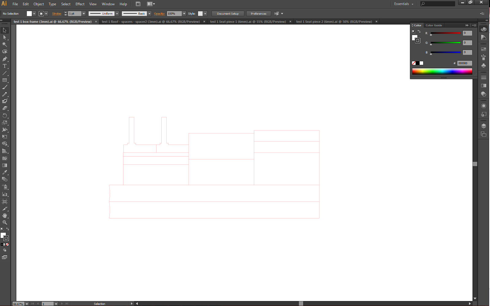
18. Re-designed/configured the overall bus stop layout19. Created laser cutting files on Illustrator
20. Laser cut the pieces, purchased the materials and built a prototype model
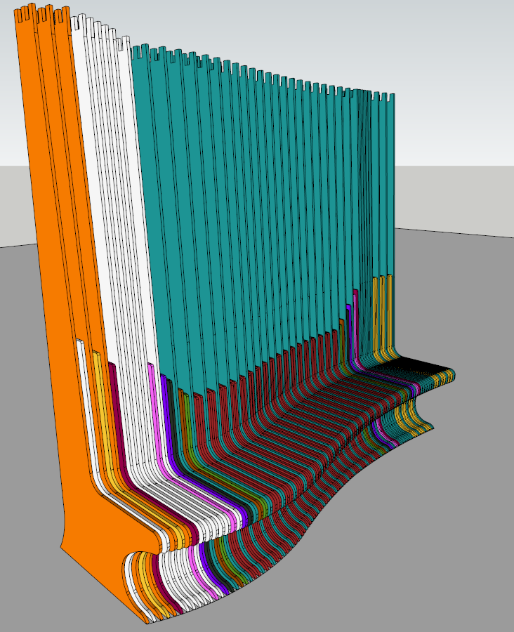
21. Colour coded all 95 (seat) model pieces into common pieces
Obtained the Original Bus Stop Files
For some reason, no files were supplied to us at the commencement of the course. Thankfully, I personally know an individual that worked on the Bus Stop during the BEIL0003 summer course and obtained the original files in week 1 directly from her. The files involved many PDF's containing rendered images, a folder full of raw JPG's, one Sketchup file and numerous AutoCAD files.
Later down the track, we realised that the file itself was NOT representative of the render displayed in the course outline. I subsequently re-contacted the person and obtained the proper up-to-date file.
Unfortunately, the crucial 3D Model file itself was created in Solidworks, as another person in the BEIL 0003 group was an industrial designer and was very familiar with solid works. Since no one knew how to use Solidworks in our group, I downloaded the Solidworks software, exported it as a 3DS Max friendly file, then re-exported it again from 3DS Max to Sketchup.
Despite being split into two groups, we were working towards the same goal, and to help the other group, I also supplied all the necessary files to help them get going as well.
Evidence:
Original (incorrect) Sketchup Model
Original (correct) Solidworks Model
Original BEIL 0003 Final Presentation PDF File download link: BEIL0003_FINAL COMPENDIUM
Original AutoCAD File download link (reassembled and refined for our group thanks to Nyla Mas): BEIL0003_FINALCAD
Created a Facebook group for the group to share and convey ideas with each other
Original AutoCAD File download link (reassembled and refined for our group thanks to Nyla Mas): BEIL0003_FINALCAD
----------------------------------------------------------------------------------------------------------------------------------
Created Facebook Group
Evidence
----------------------------------------------------------------------------------------------------------------------------------
Created Group Presentation (Back Briefs)
Evidence
----------------------------------------------------------------------------------------------------------------------------------
Created Gantt Chart and Timeline
I created the Gantt Chart and the Timeline. These were used for the back brief presentation in week 3. Both were created using a free to download Microsoft Powerpoint plugin called "Office Timeline"
Evidence
Office Timeline website: http://www.officetimeline.com/
Evidence
Office Timeline website: http://www.officetimeline.com/
----------------------------------------------------------------------------------------------------------------------------------
Tracked Down and Identified Legal Guidelines Surrounding Bus Stop Design
Using the Australian Standards database, I was able to locate the specific standards that dictate the legal dimensions for bus stop design and public furniture.
Evidence
Blog Link (20/03/14): Bus Stop Guidelines and Standards
Evidence
----------------------------------------------------------------------------------------------------------------------------------
----------------------------------------------------------------------------------------------------------------------------------
Attended Meetings with Elliot Rosenberg and Hank Haeusler
I have attended every single face to face meeting (excluding one) with Elliot (and sometimes Hank if he makes an appearance) since the beginning of the semester. These meetings are crucial in order to update Elliot and Hank on our progress, our problems and our ideas.
I have also periodically emailed Elliot when ideas or problems arise.
Evidence
I have also periodically emailed Elliot when ideas or problems arise.
Refer to Elliot in person about my weekly attendance.
Screen shots of some of the email conversations:
----------------------------------------------------------------------------------------------------------------------------------
Project Leader Tasks
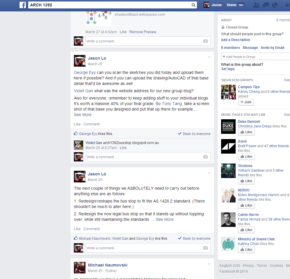
As the designated project leader, I have had to organise the group and keep members updated on meetings, allocating roles and general information.
Evidence
Facebook group screenshots:
----------------------------------------------------------------------------------------------------------------------------------
----------------------------------------------------------------------------------------------------------------------------------
Created the Group Wiki and Group Planning Presentation
The group wiki and Presentation content (and script) was created by myself. All of this involved identifying a suitable wiki website, typing all the content for the wiki, recording the required video content and doing the video editing and uploading.
Evidence
Wiki Creation and Content:
----------------------------------------------------------------------------------------------------------------------------------
Identified and Pushed for Sponsorship Materials
I took the initiative and identified two suitable materials and companies that could potentially supply us with the material we need.
The first company called Tilling Timber is a timber supplier located in Australia. They provide a range of products including laminated timbers and I approached them for a price quote and a possible sponsorship deal. The product I was pushing for is called cross laminated timber and originates from another company called KLH in Germany.
The second company is called Accoya. Accoya develops their own proprietary wood products which involve artificially changing the chemical and physical structure of the wood through acetylation. The resultant engineered wood is highly resistant to fungus and insect attack, is sustainable, environmentally friendly and is structurally durable and strong.
Evidence
The second company is called Accoya. Accoya develops their own proprietary wood products which involve artificially changing the chemical and physical structure of the wood through acetylation. The resultant engineered wood is highly resistant to fungus and insect attack, is sustainable, environmentally friendly and is structurally durable and strong.
Tilling Timber Website: Tilling
KLH Website: KLH
Accoya Website: Accoya
Tilling Timber Email Screenshots:
KLH Website: KLH
Accoya Website: Accoya
Tilling Timber Email Screenshots:
----------------------------------------------------------------------------------------------------------------------------------
Model Ideas and Redesigns
The following is a sub-list of all the work I have done on the design/model (by myself):
1. Early model design idea (with incorrect file) and crude foam core model
Evidence:
2. Allocated the design into separate modules
Evidence: Full Design File
3. Redesign of the mid-section modules
4. Addition of base supports (feet)
Evidence:
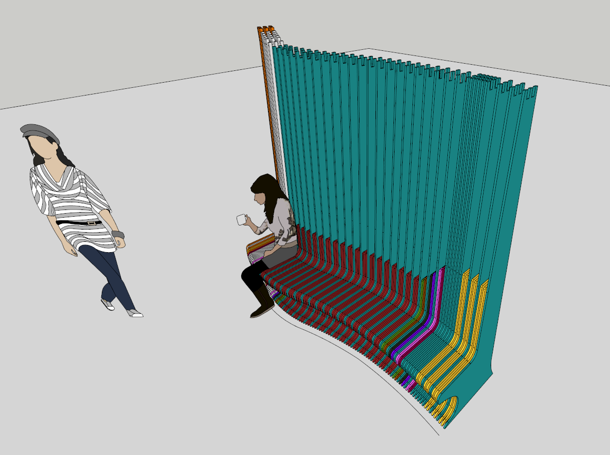
5. Re-design of the Seat Positioning/Configuration
----------------------------------------------------------------------------------------------------------------------------------
Contacting John Carrick for Engineering Advice
I made an attempt to contact John Carrick (a senior Architecture lecturer with a strong background in structural engineering) to see if he would be able to give a second opinion on a roof structure idea I had developed. Credit goes to tutor Stephen Davey for suggesting the idea to contact John Carrick.
Evidence
Email to John Carrick (no response):
Roof Idea/design:
----------------------------------------------------------------------------------------------------------------------------------
Built the Laser Cut Prototype
George and Michael developed an idea for the use of a 'T' shaped base for the seats to slot in on.
I modified this idea and utilised my own 'L' shape instead, and decided to go ahead with this design as a side experiment for the group. I created a laser cut file, purchased the necessary materials (3mm and 6mm MDF), laser cut the pieces and then assembled them into a 1:5 prototype using super glue.
The laser cutting was a great learning experience. With the particular laser cutters in the FBE lab, I know now that to cut 6mm MDF, you'll need to:
-set the material width to 6.35mm
-set the speed to 3% or less
-have the power set to 100%
For 3mm MDF
-set the material width to 4.50mm
-set the speed to 5% or less
-have the power set to 100%
I know these parameters due to the fact that the pieces were not completely cut properly the first time around. The laser either got very close to cutting all the way through, or only half way through (as seen in my photo's). Unfortunately I had to resort to using a jigsaw to cut the rest of the pieces out.
Evidence
The laser cutting was a great learning experience. With the particular laser cutters in the FBE lab, I know now that to cut 6mm MDF, you'll need to:
-have the power set to 100%
For 3mm MDF
-set the material width to 4.50mm
-have the power set to 100%
I know these parameters due to the fact that the pieces were not completely cut properly the first time around. The laser either got very close to cutting all the way through, or only half way through (as seen in my photo's). Unfortunately I had to resort to using a jigsaw to cut the rest of the pieces out.
Sketchup Model:
Laser cutting files:
Model pieces and assembly:
----------------------------------------------------------------------------------------------------------------------------------
Design Calculations
I undertook the calculations for:
-The weight of the design (the seat portion without roof)
-The number of pieces needed
-The amount of material needed
-The cost of materials needed
Evidence
I arranged seat pieces into common pieces via colour coordination:
I then arranged the seat pieces onto potential CNC sheets (each sheet measuring 2440mm x 1220mm):
Original layout (very inefficient: 30 sheets)
Final layout (23 sheets)
The weight was calculated by identifying the weight of one sheet of marine plywood material which came to 27.1 kg.
From there, the volume of that sheet was also calculated. The volumes of every single piece was then calculated and their weights were mathematically derived from the weight:volume ratio of a full 27.1kg sheet.
For example:
Marine Plywood sheet
Volume = 35721.6 cm³
Weight = 27.1 Kg
Red Seat Piece
Volume = 3358.9 cm³
Weight = ?
Calculation
1kg = 1318.14 cm³∴ Red Seat Piece = (3358.9 / 1318.14) = 2.55 Kg
Number of pieces: 95
Weight (without roof): 333kg (approx)
Amount of Material Needed: 23 Sheets of marine plywood @ 2440mm x 1220 mm x 12mm
Material Cost: 79.00$ x 23 sheets = $1817.00
Material Cost: 79.00$ x 23 sheets = $1817.00
----------------------------------------------------------------------------------------------------------------------------------
Final Summary of Work
Summary list of the individual work/milestones I have done
1. Acquired Bus Stop Files from previous students
2. Created Facebook Group
3. Created Week 3 Back Brief Presentation
4. Created Gantt Chart and Timeline for the group
5. Completed the legal research
6. Weekly meetings and communication with Elliot and Hank
7. Project leader management
8. Created the Group Wiki
9. Created the Week 7 Planning Presentation
10. Created the 3 minute video (recording and editing) for the Week 7 Presentation
11. Contacted material suppliers for sponsorships discounts and/or deals
12. Created a preliminary foam core model (pole design/idea)
13. Arranged model into separate sections
14. Re-designed/modelled mid section to streamline fabrication process
15. Designed and modelled base supports (feet) to stop the design from toppling forward
16. Designed and modelled potential roof connection detail/assembly
17. Designed and modelled 'L' base
18. Re-designed/configured the overall bus stop layout19. Created laser cutting files on Illustrator
20. Laser cut the pieces, purchased the materials and built a prototype model
21. Colour coded all 95 (seat) model pieces into common pieces
22. Arranged all seat pieces into 23 CNC sheets
23. Performed cost, weight and material amount calculations
23. Performed cost, weight and material amount calculations
Subscribe to:
Comments (Atom)


.jpg)
.jpg)
.jpg)
.jpg)


.jpg)
.jpg)
.jpg)
.jpg)
.jpg)
.jpg)
.jpg)
.jpg)
.jpg)
.jpg)
.jpg)
.jpg)
.jpg)
.jpg)
.jpg)
.jpg)


